Project
Deliverables
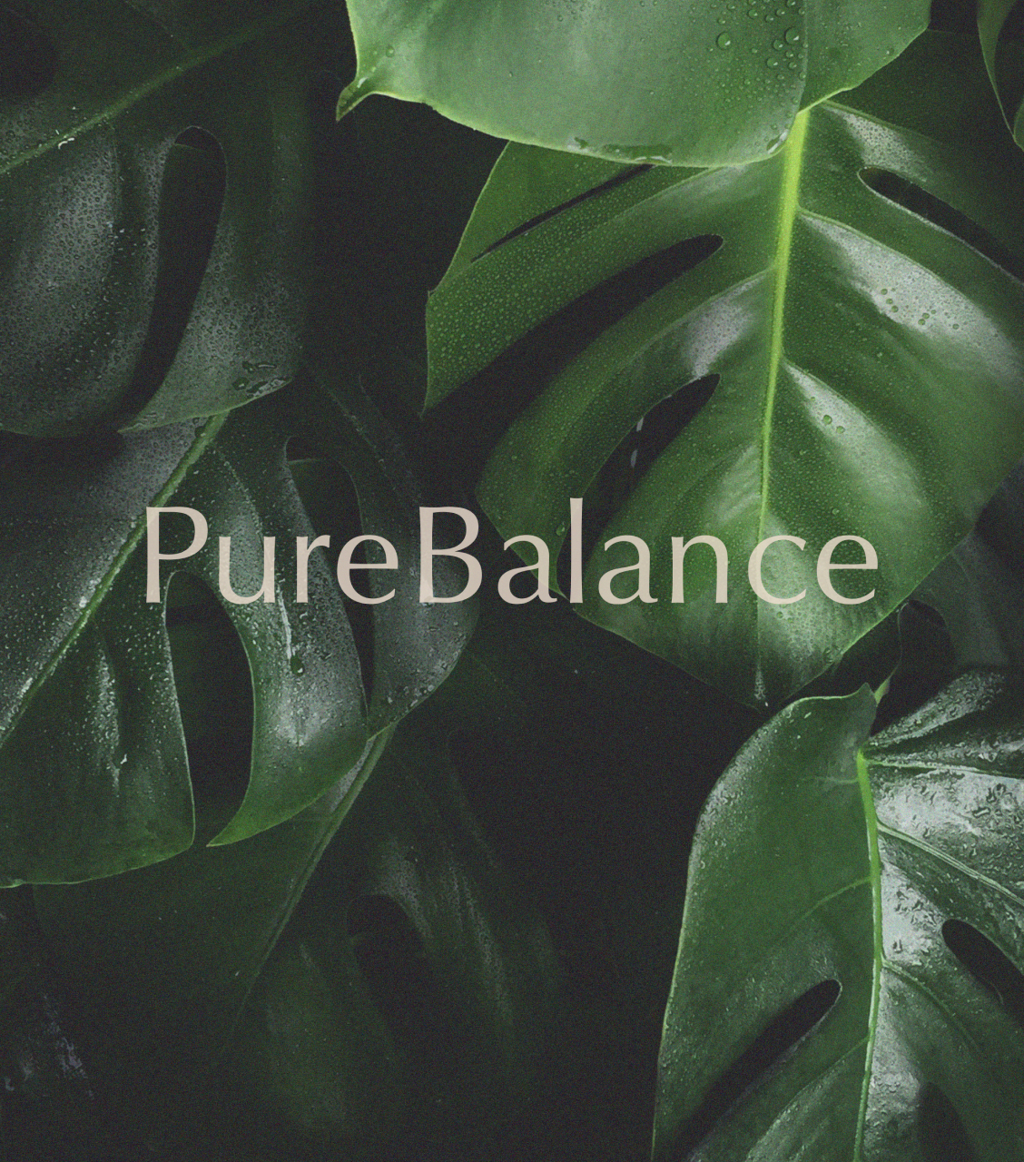
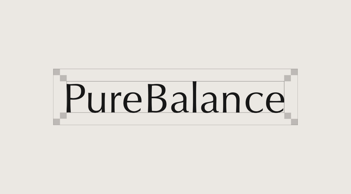
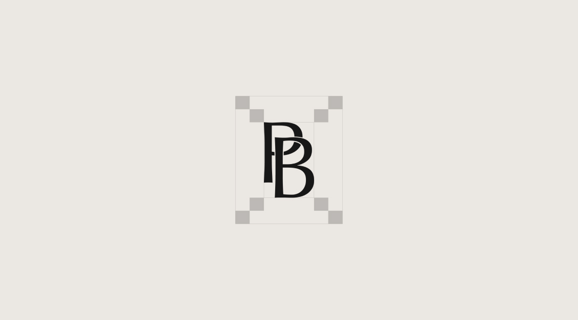
Based in Ludwigshafen, Germany, PureBalance is a well-known health supplement brand. With seven years in the market, the brand prioritizes staying current and meeting customer needs. Tailored for women aged 30-60, their supplements also benefit younger adults aged 20-40.
Hei Design Studio helped PureBalance rebrand their products with a fresh, modern look that appeals to a younger audience through new packaging, branding, visuals, and a promotional video to enhance online sales.


As the foundation for the brand's identity, we developed warm natural tones inspired by the German forest and nature. The calm tones and fluid lines give a feeling of sophistication and elegance, instilling trust and reliability in the brand's appearance.


Wood
#726b66
R: 114, G: 107, B: 102
C: 53% M: 51% Y: 53% K: 18%

Green leaves
#73785c
R: 115, G: 120, B: 92
C: 55% M: 40% Y: 69% K: 17%

Sand beige
#efdfd0
R: 239, G: 223, B: 208
C: 4% M: 12% Y: 17% K: 0%
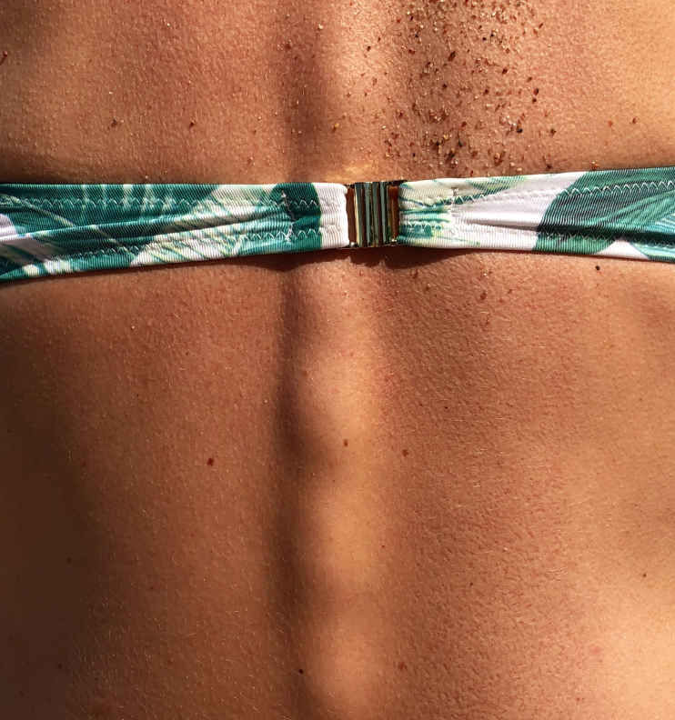
To strengthen the brand image, we planned a photography direction centered on warm-toned natural photos featuring nature, women, and simplistic aesthetics. Such images can foster a sense of comfort, relaxation, and simplicity, effectively attracting and engaging the target audience.


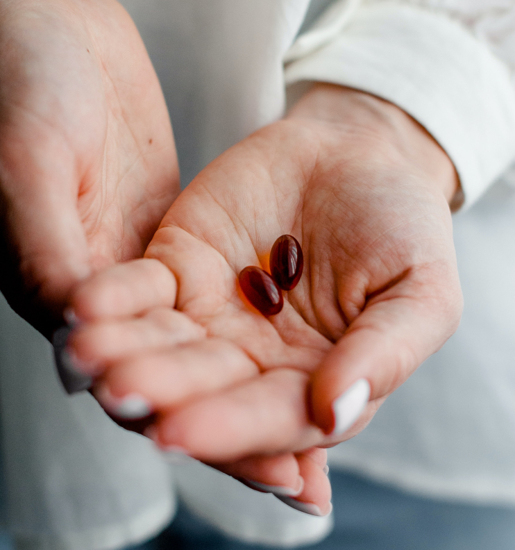
Vitamin packaging in nature tones symbolizes a commitment to purity and natural ingredients, reflecting the brand's emphasis on wholesome, organic products.
Additionally, the use of dark glass signifies an understanding of the importance of protecting the vitamins from light and preserving their strength, emphasizing the brand's dedication to delivering high-quality supplements.


